One of the things that people liked about an older version of the site, from about 2009 or so, was that all of their stats were on one page. There were a few peripheral pages, but mostly it was just one. I had problems with that, because with most of the stuff on that page being generated on the server before sending it back, people who owned and played a lot of games had pages that took minutes to load. I figured that people didn’t want to wait for that long, and probably just scrolled through pretty quickly anyway, so I split the page into 6 tabs, and put less stuff on each. That’s the way the old site is today.
For the new site, I want a different feel – less like statistics and more like a game. In particular, it seems to be sort of a Stefan Feld game, with lots of complicated bits that (hopefully one day) work well together. So I will be encouraging people to explore a lot, and of course I need to build the site so that there is some exploring to be done (instead of lots of dead-ends like there are at the moment).
Nevertheless, people need a place to bookmark, and that is what the geek page is. Now I know it looks kinda gaudy, but Gaudi was a really famous guy and Hundertwasser is not so bad either, so maybe there is hope for me. But seriously, once I define the basic style of the site I will take some advice on the colours.
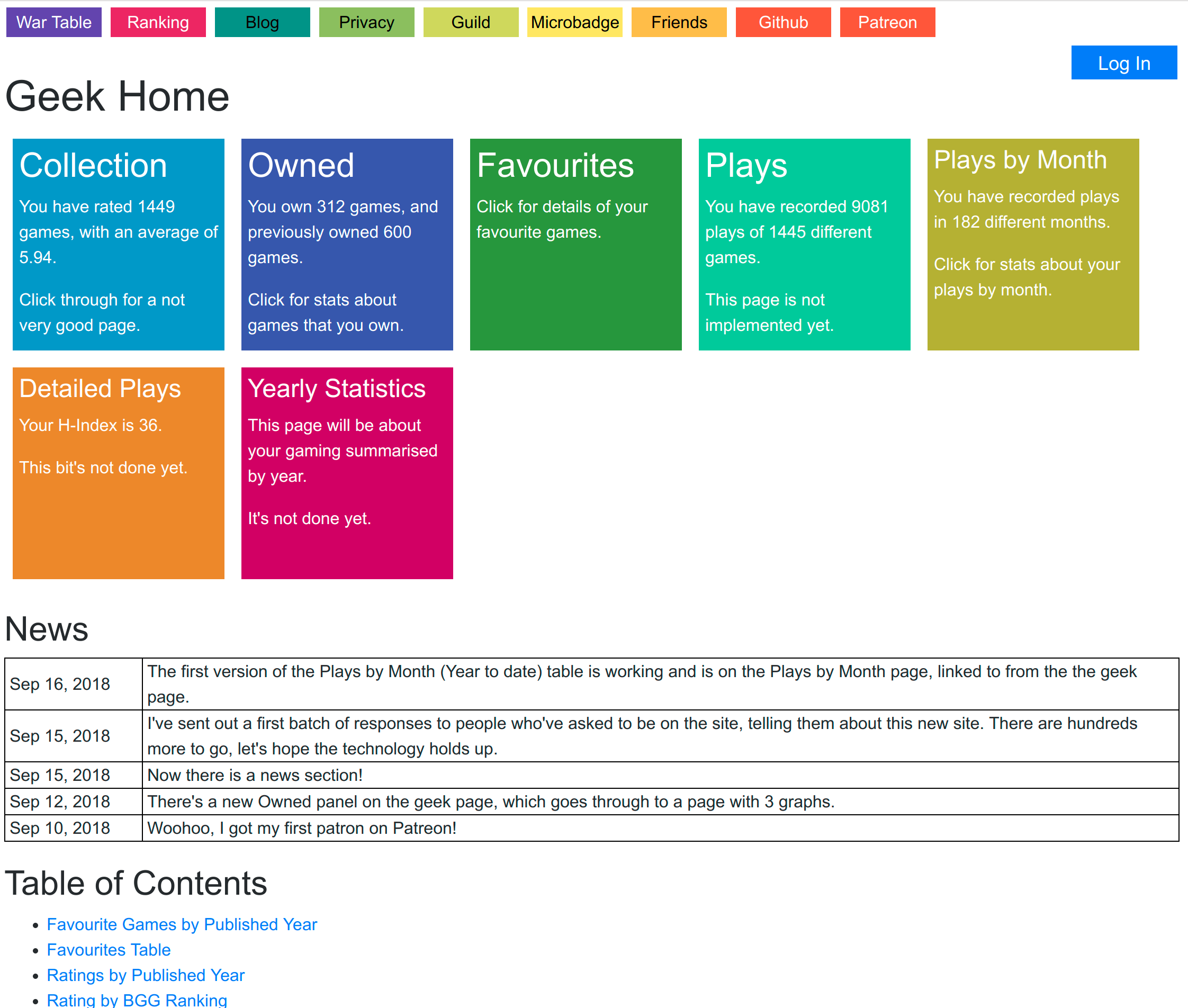
At the top there, we have the navigation bar. That’s so that a few singleton links are always available. I just had a thought that the Privacy button and maybe the Github button would be better in a footer. Then I could put other stuff in the navbar, and the navbar and the footer bar together could look a bit like a score track around the edge of the board.
Then there’s the page title and the Log In button. The Log In button stands out like a sort thumb there, and I don’t like it very much. I want it to expand into some sort of user identity. At the moment, if you’re logged in it turns into a Log Out button and has your user name underneath, and your user name is a link to your user page. Your user page is to a user what the geek page is to a geek, except that users aren’t very much yet so that page is really dull.
Then we get to the large coloured panels, each of which is a hyperlink to another page. Well, some of them are dead links which go through to the home page, but I’m working on that. So when I code up new features, they go behind one of those panels. The panels themselves contain a few statistics, some of which are not available elsewhere on the site. That’s your reward for having to put up with my colour scheme.
Below the panels is the News section. This is black and white as all good news is. I figured that this was a good way to tell users about new things, but also to give the impression that the site is continually improving. With luck, people will see the news and go find the new things I mention.
Finally there’s the Table of Contents. It’s a little out of date and it’s also a little bit rubbish. I intended that the hyperlinks take you to features on other pages, but as the other pages depend heavily on JavaScript, they take you to the other page and then the thing you’re going to hasn’t loaded yet because the JavaScript hasn’t run. I’m not sure how to get around that yet, hence the disrepair.
Finally, eagle-eyed users will eventually notice that some pages take URL parameters, e.g. “?geek=Friendless”, and some don’t. I’m not sure whether I’m being cunning with that or not. What happens is, if you put that parameter on the URL, it sets the geek for the page to whomever you said. And then if you go to another page without a geek parameter on the URL, it remembers who it was set to previously. This is somewhere between convenient and confusing, especially as if there’s no parameter in the URL it’s impossible to know what geek the page is for. That’s on my very long list of things I need to sort out at some point.