Semiology of Graphics

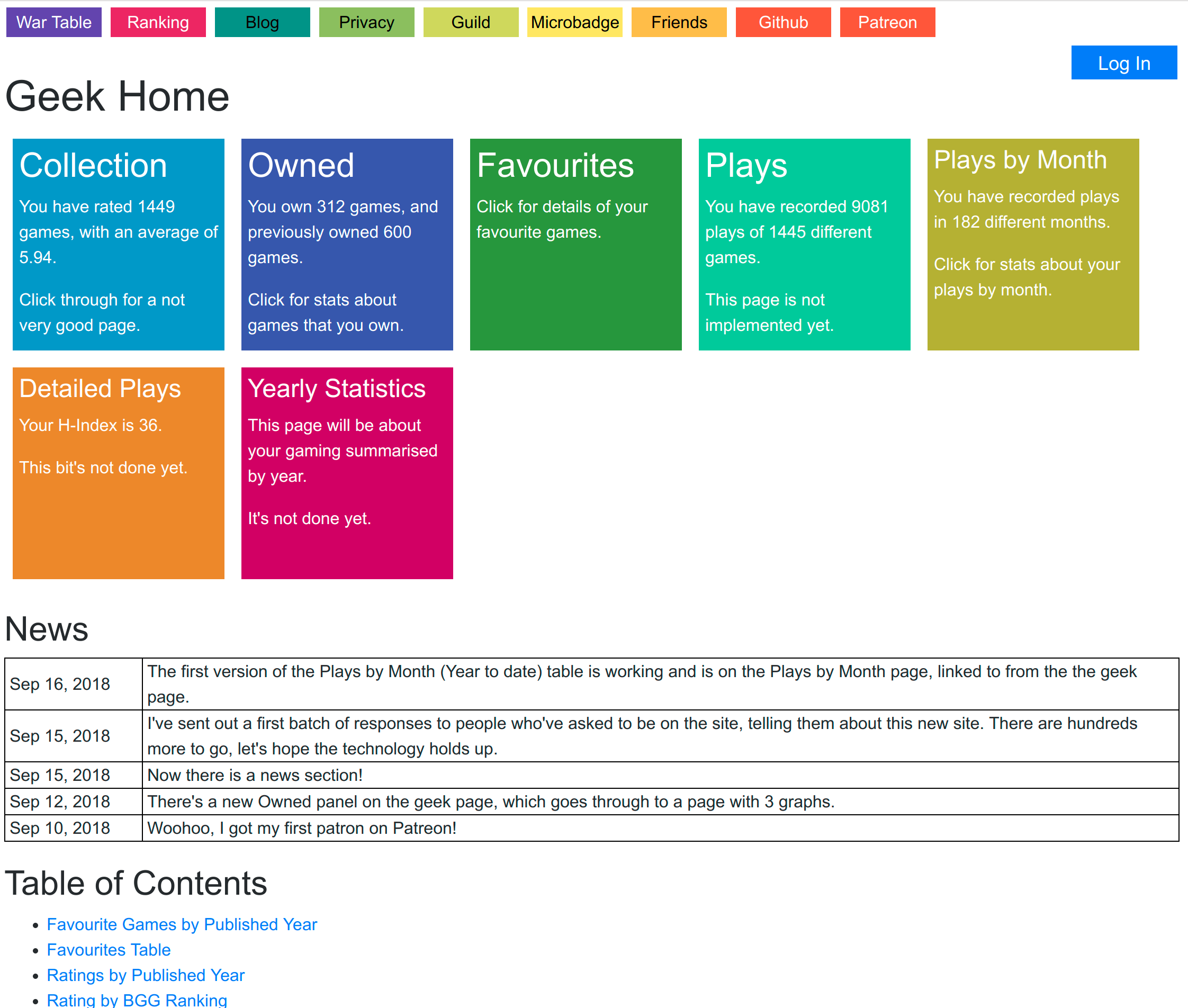
A couple of weeks ago I was researching some Vega stuff (remember, Vega is the charting package I use for the site) and I found a reference to some software called D3. D3 is software that’s used to transform raw data to data for visualisation, and Vega is heavily based upon it. I don’t know the exact boundaries between the two. So I was reading about D3, and I found mention of a book called “Semiology of Graphics”, which is apparently a seminal work in the area. So I went to Amazon and bought a copy.

It arrived on Thursday. It’s a massive heavy book, like the Edward Tufte books, and it’s rather more academic than I anticipated. Because y’know, a book about semiology was always gonna be light reading, wasn’t it? Even before I sat down to read it I got an idea for a graphic for the site, so I grabbed a blank note book and a pen and started reading Semiology of Graphics.

So far I have got past the bit where he defines the terms he’s going to be using. Oh goodness I hope I am past that bit. However I have about 7 pages of ideas so far. I hope I am getting to the good bits soon.

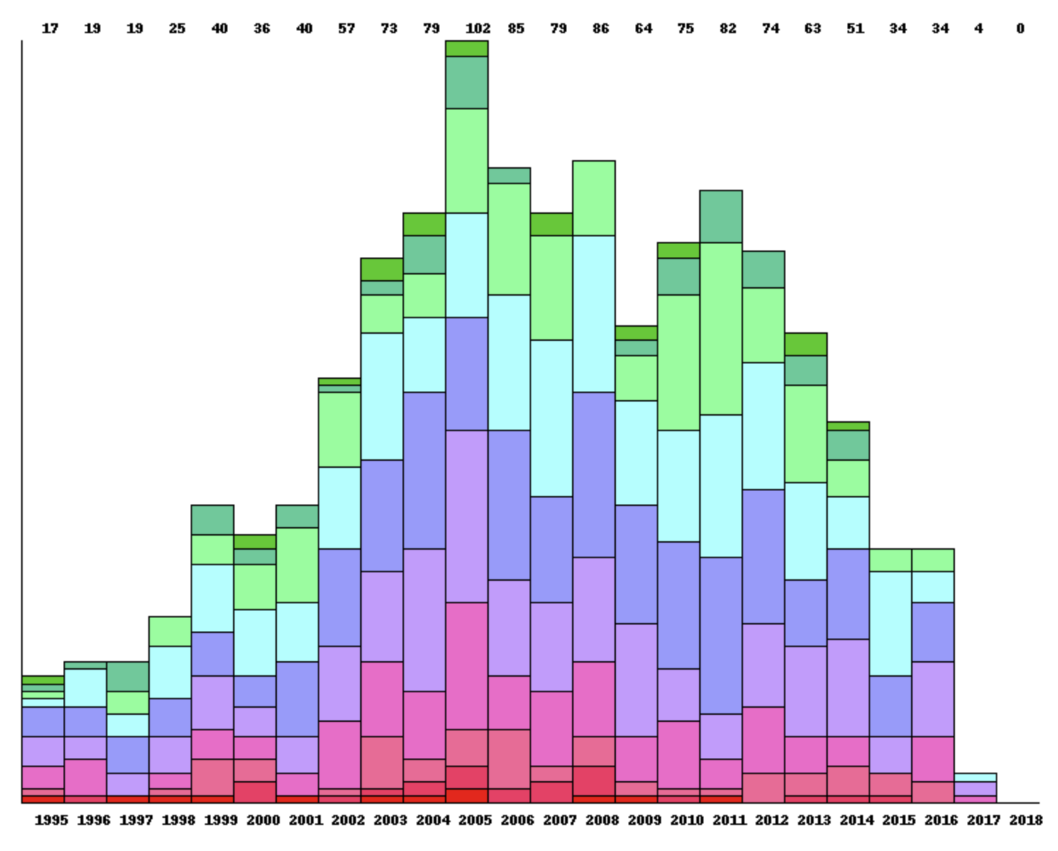
Certainly I’m thinking about the data that the site displays in a different way. Geeks and games are qualitative data – they are incomparable and unordered. However they can be classified – geeks from Australia vs those from Germany, games which won the SdJ vs those which use Dice Rolling.

On the other hand, ratings and numbers of plays are quantitative data – they can be sorted. The quantitative data are used to describe the relationships between the geeks and the games. There are also a few dates involved, which are quantitative data as well.

I guess the site is about illustrating the interplay between the quantitative and qualitative data, particularly with the qualitative data being used to place the games in 2D space. Or, as the book points out, in 2D space with a variety of techniques being used to illustrate further dimensions of the data.

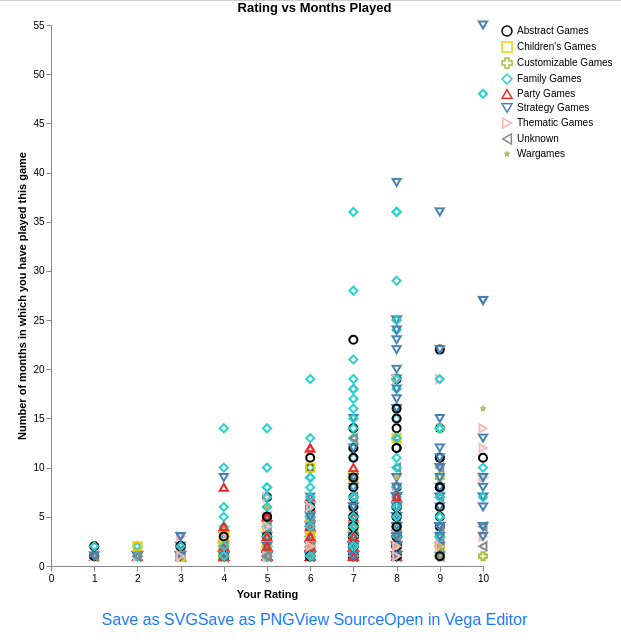
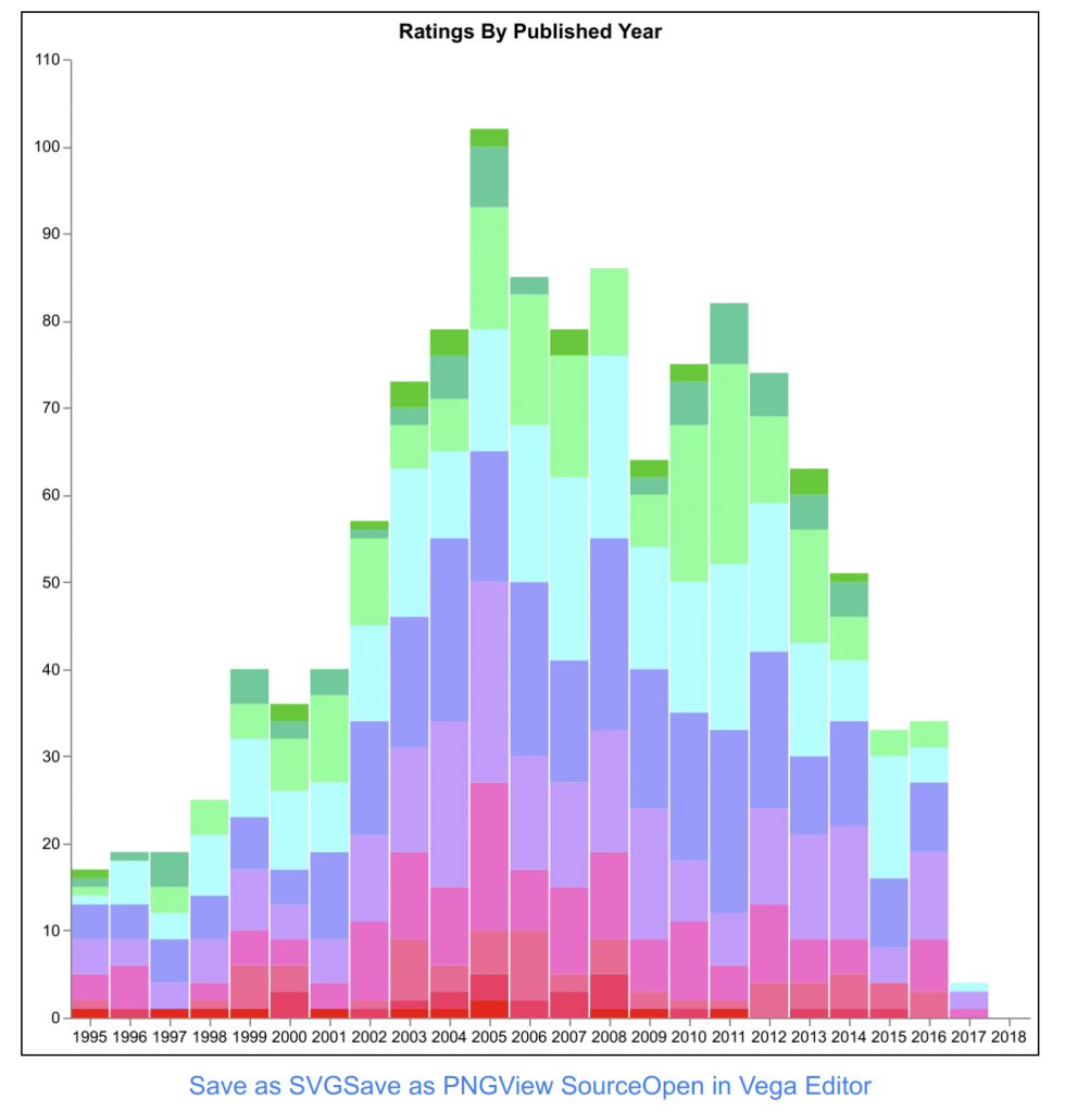
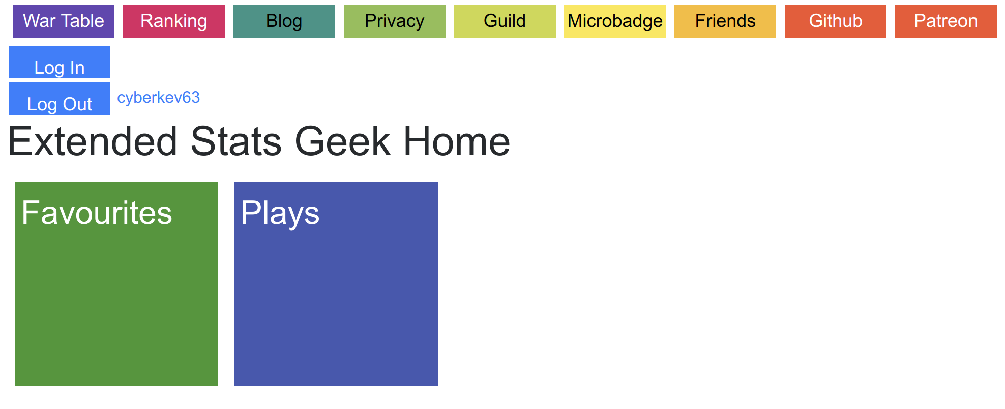
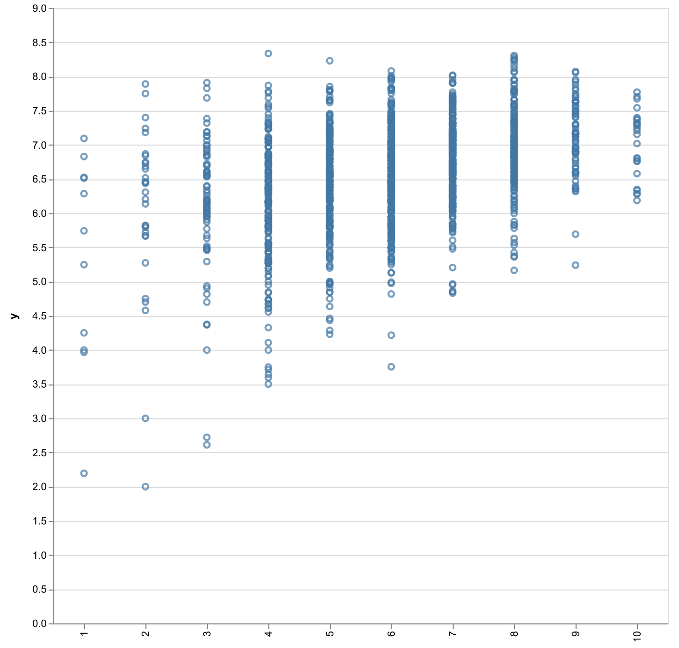
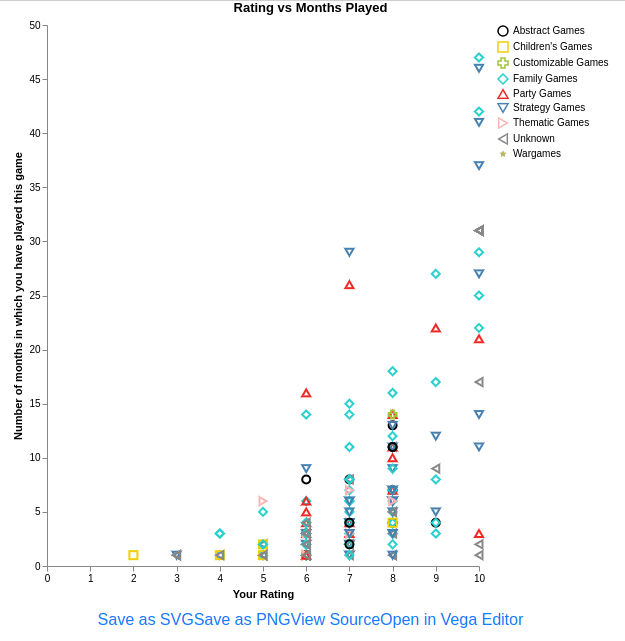
The image is the new version of the Rating vs Months played graph. The shapes and colours mean the same thing, because of colour-blindness. The chart illustrates that the games I keep coming back to are family games and strategy games. The family games are sort of a light strategy genre, so it seems that’s what I’m like. The same graph for cyberkev63 (shown below) has much more prominent red triangles for party games, which he is well-known for.

So that’s where the Semiology of Graphics has got me so far.

This weekend I’m off on a trip to Europe (not for Essen, as far as I know), so I will be distracted for a couple of weeks. I wish life would not get in the way of the development of the site! I guess the original site evolved over a few years, I should not be so impatient that the all-new even-better site is taking some time.

The Geek Page

One of the things that people liked about an older version of the site, from about 2009 or so, was that all of their stats were on one page. There were a few peripheral pages, but mostly it was just one. I had problems with that, because with most of the stuff on that page being generated on the server before sending it back, people who owned and played a lot of games had pages that took minutes to load. I figured that people didn’t want to wait for that long, and probably just scrolled through pretty quickly anyway, so I split the page into 6 tabs, and put less stuff on each. That’s the way the old site is today.

For the new site, I want a different feel – less like statistics and more like a game. In particular, it seems to be sort of a Stefan Feld game, with lots of complicated bits that (hopefully one day) work well together. So I will be encouraging people to explore a lot, and of course I need to build the site so that there is some exploring to be done (instead of lots of dead-ends like there are at the moment).

Nevertheless, people need a place to bookmark, and that is what the geek page is. Now I know it looks kinda gaudy, but Gaudi was a really famous guy and Hundertwasser is not so bad either, so maybe there is hope for me. But seriously, once I define the basic style of the site I will take some advice on the colours.

The Geek Page

At the top there, we have the navigation bar. That’s so that a few singleton links are always available. I just had a thought that the Privacy button and maybe the Github button would be better in a footer. Then I could put other stuff in the navbar, and the navbar and the footer bar together could look a bit like a score track around the edge of the board.

Then there’s the page title and the Log In button. The Log In button stands out like a sort thumb there, and I don’t like it very much. I want it to expand into some sort of user identity. At the moment, if you’re logged in it turns into a Log Out button and has your user name underneath, and your user name is a  link to your user page. Your user page is to a user what the geek page is to a geek, except that users aren’t very much yet so that page is really dull.

Then we get to the large coloured panels, each of which is a hyperlink to another page. Well, some of them are dead links which go through to the home page, but I’m working on that. So when I code up new features, they go behind one of those panels. The panels themselves contain a few statistics, some of which are not available elsewhere on the site. That’s your reward for having to put up with my colour scheme.

Below the panels is the News section. This is black and white as all good news is. I figured that this was a good way to tell users about new things, but also to give the impression that the site is continually improving. With luck, people will see the news and go find the new things I mention.

Finally there’s the Table of Contents. It’s a little out of date and it’s also a little bit rubbish. I intended that the hyperlinks take you to features on other pages, but as the other pages depend heavily on JavaScript, they take you to the other page and then the thing you’re going to hasn’t loaded yet because the JavaScript hasn’t run. I’m not sure how to get around that yet, hence the disrepair.

Finally, eagle-eyed users will eventually notice that some pages take URL parameters, e.g. “?geek=Friendless”, and some don’t. I’m not sure whether I’m being cunning with that or not. What happens is, if you put that parameter on the URL, it sets the geek for the page to whomever you said. And then if you go to another page without a geek parameter on the URL, it remembers who it was set to previously. This is somewhere between convenient and confusing, especially as if there’s no parameter in the URL it’s impossible to know what geek the page is for. That’s on my very long list of things I need to sort out at some point.

Why Yes, There Is Method to My Madness

Just this evening I released an update to the site. I added a new panel to the geek page. In case you don’t know the geek page, it’s something like:

https://extstats.drfriendless.com/geek.html?geek=Ozjesting

It’s the central page related to a particular geek. At the moment there are 6 panels, of which you can click on 3 to get through to other pages. On those 3 pages there are various tables and graphs and so on.

The question you are no doubt asking is “how do tables and graphs get allocated to those pages? Does DrFriendless just pick up the nearest page and jam some more stuff on it?”

That’s how I used to do it on the old site, pretty much, but I’m a grown-up now. These days I’m thinking about performance, so I group features (that’s what the old site calls tables and graphs) by the data that they use. For example, the Owned Games page uses games data (name, BGG average, etc) and geek game data (your rating for the game, whether you own it), for only the games that you own. When the page loads, it goes and retrieves exactly that data once and gives it to all of the features, which then display using the same data set.

If you understand selectors, then you’ll understand that a selector can be used to choose which games to return, so of course I do. The ultimate goal is to be able to change the selector on the page, so that if you want to display games you own but not books or expansions, you’ll be able to do so. I’ve made some progress on that plan (on the favourites page) but it is not widespread yet.

The other factor in the data query is what data to return for each game, and that is fixed for the page. The pie chart for your ratings of games you own will never display plays – there’s just nowhere for them to go – so that data is unnecessary and should not be retrieved. So you don’t get to mess with what data is available for each game.

I guess it’s possible to display the owned games page using games that you previously owned, but that might be weird. On the other hand it might be genius, we’ll see what people come up with.

Now, there is even more method. Given that the page does just one query for data, I can cache that. Browsers these days have a thing called browser local storage where the web page can store stuff for later. So I could save the data for the page in browser local storage and just get it back from there later. This means (a) you wouldn’t have to wait to get the data and it wouldn’t come off your bandwidth allowance, and (b) it might be a bit out of date. So it would be best if that feature was used when you were on your phone and not so much on your desktop. When I get to putting that in I’ll make it configurable.

In other news, there is so much other news! I have more blog posts to write, but I also have more code to write and that’s more important. Stay tuned.

Welcome to New Users!

Well, I think it’s about time. In January I suspended addition of new users to Extended Stats due to capacity problems. I then procrastinated for a few months because I wasn’t sure how to solve some technical problems and didn’t know how to proceed. Then in June I solved the problems and progressed onto a proof-of-concept phase.

Development activity on Extended Stats over time (from Github)

However Extended Stats is not just about programming, it’s also about management of the site and management of the users on it. By “management of users”, I don’t mean “herding”, I really mean communicating with them, setting expectations, and participating in a conversation with them about the site. And for a few months or maybe years, I have been really bad at that. And I will probably will remain really bad at it, that’s just what I’m like.

So one of the tasks I have to start doing now is onboarding new users to the new site. New users don’t get to be added to the old site as it’s overloaded, for which I hope they will forgive me. However I’m hoping that the new site will satisfy some of their expectations at first, and any more over time. There’s a post here about why the new site and the old site are so radically different:

Why Rewrite?

Now I guess new users will want to know WHERE’S MY PRETTY PICTURES? SHOW ME THE PICTURES! That’s a problem I’m still working on, but a good starting point is:
https://extstats.drfriendless.com/geek.html?geek=Friendless

but of course you should change “Friendless” to your boardgamegeek user name. That page will remain an index of all of the things related to you. In particular if you go through to Favourites or Collection there are some nice bits.

Now, if I still have your attention, I have a bit of a chat about privacy in this post:

Watch Out, There Might Be COOKIES.

I just had a look at auth0 (which manages logins for me), and the site now has 7 users with accounts, which I think is pretty impressive given that logging in achieves nothing so far :-). By the way, auth0 does not let me access those users’ passwords – it always worries me when I log in to a hobby site like this that I’m giving my password to some unknown nerd who might try to use it on other sites. Don’t worry about that, I cannot see your passwords as far as I know. I like it like that. Here’s more chatter about users.

It would be foolish of me to not mention to a dedicated reader such as yourself that the site is not free for me to run. I blog about the costs every month when the bill arrives. If you want to help, find the Patreon button on the site.

So, what happens next? Well there are a whole bunch of features that I need to port to the new site, so I’m going to be busy. I’m going to be distracted by a few other things until about November, so it’s probably going to be slow. One idea I had this morning was about how to prioritise what I should implement next. Of course, it involves writing code, so that in itself is a feature that needs to be implemented.

Thank you for using Extended Stats! I hope that the site can grow to meet your expectations, and I hope that you enjoy the ride!

Before and After

I mentioned a couple of weeks ago that I needed to do a big survey of all of the features in the old site, and make a plan for getting them onto the new site. And that I  had a big block of drawing paper specifically for such situations. Well, that bit’s true, but when it came to the crunch, I was sitting in bed with my laptop and couldn’t be bothered getting the drawing paper, so I had a(nother) look at Trello, and discovered that Trello is a great tool for organising a bunch of pictures into groups. So now I have a Trello board with the work that needs to be done to get the new site being as useful as the old site.

Trello board

I’ve been doing a lot of under the water work on the Favourites page, and spent the morning extracting bits of that code in the hope that I could use them again for other things. It was pretty cool from a programmer point of view, but useless from a user point of view. But then I decided that I would take the good bits that I’d extracted from the Favourites page and apply them to the User Collection page, which is the first table I did. I sort of wondered where that page was going, but it was supposed to correspond to one of the columns on the Trello board.

About then was when I realised that I’d deleted the user collection source code in a fit of cleaning one day. It’s on Github, I could have got it back, but when I consulted Trello to find out what the table on that page was supposed to look like, there wasn’t one. So I didn’t bother. Technically that page could hold a table which included differences between your rating and BGG averages, but that’s on BGG as Aldie stole the idea from me many years ago. Maybe I’ll make that table one day, but this is not that day.

There were three things in that column, but I only had time to get one done, so I chose a pretty one. It was the ratings by published year graph which looks like this on the old site:

You may remember from previous posts that I’m using a charting package called Vega. Vega is lovely and horrible at the same time.  It’s very powerful and the charts are very beautiful, but Vega does not play very well with Angular, so it’s always a bit of a pain to get it working. However after a couple of hours I got it sorted.

If you click through that image you will get to a live demo on the test site. (I usually link to the test site from the blog, as the live site gets changes about 24 hours later due to the CDN.) As I write this, there’s still more work to be done on that chart (e.g. tooltips, configurable start year), but it’s about as good as the old one. So I’m faintly pleased with that work.

In other news, the Favourites table got The Most Advanced Feature Yet! As well as having the Documentation button, and the Charts button, it got a Configuration button. The configuration button lets you change the selector that the table uses to load games. And of course if you do that then do charts, they are based on the new data that you loaded. This is very exciting to me, and maybe one other person.

The plan is that logged-in users will be able to store their preferred selector for each page. I’m not so far off achieving that, despite the login button being a bit broken at the moment, and not much functionality having been achieved on other parts of the site. But, it’s a brave new world that has such features in it.

Considering User Experience

My wife is an information science academic, meaning that she spends her time thinking about how people interact with information. For example, what’s in your mind when you’re doing a Google search. Or when the doctor tells you you have to stop smoking or you’ll die, what bit of that don’t you understand. She talks about things like “affordances”, which means sort of “a thing that’s available for you to do things”, e.g. a button or a door handle.

So user experience is not an alien concept to me, but you wouldn’t know that given how crappy the site has been so far. I’ve been doing that thing like a duck does, with a whole lot of furious activity under the water, while above the water the site has been serenely useless. Today’s job was to address that.

During the week I got the geek page working. Actually, no, that was this morning. It’s been a long day. The geek page is like this:

https://extstats.drfriendless.com/geek.html?geek=Friendless

It’s a page all about one BGG user. It has links to various bits of the site, some of which I’ve even done and work properly. So if you can get to the geek page, you can find your stats.

Then today I coded up an idea I had last night for the front page of the site (extstats.drfriendless.com). It’s like a FAQ with stats. I think geeks will get it, and they’ll play with it, and be able to find the rest of the site. If you have ideas for FAQs, please suggest them to me.

Also, calloo callay, I got the blasted login button to go to the right hand side of the page.

Oh What A Tangled Web We Weave

I’ve spent the day working on cleaning up a few things. When I started this project I didn’t know what could succeed, and I tried a few different ways of doing things. Time has shown me better ways, so I’ve gone back and revised a lot of things.

I’ve extracted two JavaScript libraries – one for the various data structures that I send around between the server and the client, and one for common user interface components (in particular, the charts). Extracting the charts out should make it easy to stick them into other views. I also need to extract the documentation component, and push some more stuff into the table component so that they can be reused as well. The tabbed view in the documentation has me a bit confused at the moment. I don’t really understand the template stuff they’re using, so I can’t fiddle with it.

The new-look navigation bar

I also updated the navigation bar to be more garish, and kinda like how it has turned out. It’s starting to give the site that look of game pieces all over the table that I’m going for.

I’ve also been working on a page that represents a geek. The more I think about the old site with the geek page with a variety of tables and diagrams on it, the more I think that’s not suitable for this site. On that site you scroll through a lot of stuff, I want this one to be more about poking around and discovering things.

The way I see it at the moment, there will be a relatively small number of different pages, but each of them will be quite complex. I need to sit down with the old site and plan out what those pages will be. Then from the geek page shown below, there will be a number of coloured squares that link to those pages. The squares will contain a little bit of data of their own, but I was too tired today to put it in there so they’re mostly blank at the moment.

You might also notice the login button hanging in there causing trouble still. Between the CDN caching stuff, Auth0 demanding https, and insolent damn thing not want to go to the right-hand side of the page, it’s wearing me down. However at least now it’s a nice colour. Work will continue on that.

But anyway, this thought process led to the conclusion that the user collection page, e.g. http://test.drfriendless.com/collection.html?geek=Gecko3D, which is not very useful, is not very useful because I’m not clear where it’s going. And that’s practically the last step before it going somewhere.

In my method of work, ideas come together when I make a Big Diagram. I even have a big drawing book for such events. I think I’ve arrived at a point where I know what the next Big Diagram has to have in it. No really, this is a great thing!

Let There Be Pretty Pictures

I went to a MongoDB meetup a couple of weeks ago. I don’t use MongoDB, but I do like the meetup and I do think I need to know about NoSQL databases. There was a talk about MongoDB Charts, which looks like a pretty whizzy product if you use MongoDB. I was particularly impressed by the pretty charts, so I had a chat to the speaker afterwards, and he told me that they use Vega, and that I could too. So I put that on my list of things to do.

Now having spent way too many days writing code for the site that was not very cool, I decided to spend today trying to shoehorn Vega into the site. It looks like it worked!

BGG Rating vs Friendless’s Rating

If you want to try it yourself, the place where it definitely works at the moment is http://test.drfriendless.com/favourites.html?geek=Friendless. test.drfriendless.com is like extstats.drfriendless.com but without the https – the content distribution network which gives me the s in https also caches my pages all over the world, and it doesn’t like it when I update stuff all the time. So when I’m programming I send the changes to test.drfriendless.com.

At the top of the table is the Documentation button, where you can find out what the table data is about. So next to that is the Charts button, which reveals more buttons to display charts. When you use one of those, the I give the data from the table to Vega and tell it to draw a chart. Because I’m using the data from the table, there’s no network call related to any of the charts at all, and it’s really quick.

So far there are just 3 charts, because as I was approaching getting them working I realised that I really don’t know anything about Vega. Vega is very clever and very complex, and I haven’t read any of the doco yet. I think I’m off to a good start though!

Of course once I’ve modified the tables so I can hook in the selectors, you’ll be able to control the range of the data. And when I figure out how to work Vega, there should be a huge number of charts to choose from.

I’m very excited. I’d better go read that doco.


What Use Are Users?

I spent most of yesterday working on login, AGAIN. I think that’s the fourth full day I’ve put into that subsystem. Except for the few minutes I spent to stick the navbar onto all of the pages. It’s ugly, but it’s kind of a fundamental component as it helps users discover what pages there are on the site.

One of the entries in the navbar is “Data Protection”.  This is not a very interesting topic, but thanks to the European Union’s General Data Protection Regulations, it’s something I probably need to deal with at some point. Having contemplated retrofitting GDPR compliance to the website at work (which is unnecessary because we only conduct business in Australia), I decided that the best way to deal with GDPR would be head-on up-front.

This is why the only thing on the User page (https://extstats.drfriendless.com/user.html) is a JSON dump of the data I store about a user. I was starting work on configuring user options, but I got bored and will have to spend probably another day on that. The sorts of things I would add first would be:

  • screen display name as other users see it
  • whether you consent to have your personal data shared with advertisers
  • what your BGG username is
  • in fact, what your BGG usernames ARE.

That suggests a few things about the future of the site. First of all, advertising. Yes, there will be some, unless I make sufficient money to fund the site some other way. In fact I tried to turn ads on already but Google refused for unexplained reasons. One day I’ll try again.

Secondly, other users seeing your screen display name. I have to admit I don’t know exactly where that’s going, but maybe one day add the ability to play games online. I’m very interested in coding games, but I guess I had better get the site going first.

Oh yeah, and your BGG user names. Some people manage multiple BGG accounts – theirs and their spouse, and their games group. So I would like to make switching between those accounts easy. Maybe I will also add geekbuddies, so that you can easily compare yourself to your buddies, or treat them as a group, or something. I did once develop an app to help decide what you and a bunch of friends might like to play, and I would love to bring that onto the new site.

The missing page in all of this is the Geek page. The Geek page will be the central place for the site’s data about a particular BGG user. Naively, I expect it to be similar to the pages in the old site where a bunch of tables and graphs are presented. I don’t think that’s practical though, for several reasons.

The web technology that I’m using to write the interactive parts of the pages, Angular, is very clever. However the one thing it can’t do is play nice with other Angular applications on the same page. Even on a page like the front page or the user page, the application on the page and the login button interfere with each other. I haven’t seen any particular errors related to that, but I don’t want to take any risks. So I need to figure out some solution to that – maybe isolating them from each other in IFRAMEs, or packaging them as Angular Elements (which don’t work very well yet).

Another argument against the pages full of features like the old site has, is that that’s a pretty archaic way to do it. All of the graphs there are generated on the server side, and the PNG data is sent to the client. As JavaScript can do some very cool stuff these, the modern way is to use the data that was loaded from the server and draw the graphs in the browser. In fact, see my next post which I haven’t written yet for more details.

This suggests that the new site will be substantially different from the old site. With selectors being more shareable, pages being much more suited to interactivity, and fancy things like graphs being easier to do, I am guessing it will be a lot more interactive and encourage exploration. What sort of experience that adds up to remains to be seen.

Finally, as I write this, the downloader is struggling to complete the download of the plays data. By struggling, I mean there are 16 files left to process out of about 300000, and those seem to be broken. So I’ll go fix that and then write another very exciting blog post.

The Bill for July

I got the AWS bill for July, and it’s not quite as amusing as the one for June was. It’s not going to destroy the project, but it does show that I need to keep an eye on costs.

The Extended Stats AWS Bill for July

Going through the significant line items, CloudWatch is one that I didn’t really want to see there. CloudWatch is cool – it’s where a lot of the graphs that I post come from. I had 4 dashboards showing me graphs, and it seems I only get 3 for free, and the 4th cost me $2.87. As I didn’t use it anyway, I trashed it.

The other component of CloudWatch is a charge for data sent to the lambda logs. It’s not for storing that data, it’s just for getting it there. I was warned weeks ago that that was going to be a problem so I cut down the amount of logging I was doing. Still, there has been a lot of activity this month due to the plays download, so there was always a bit of logging from that. Let’s see how it goes next month.

The Data Transfer costs are small so far, but I’m not sure whether they’re for me downloading data or for me sending out requested data. If it’s the latter, the site is in trouble when I start advertising it to 3000 users. Let’s watch that one.

The Elastic Compute Cloud costs are for the blog. I realised that cost was coming so during the month I decreased the size of the virtual machine that the blog was hosted on, and that cost should be less next month.

The costs for Lambda are for way exceeding the free quota of time and compute power. I suspect that is also related to the plays download.

The Relational Database Service costs are for the database, and that one will probably go higher next month. As mentioned in previous posts I had to upgrade the database during the month so that it could cope with the plays download load, and it’s still not doing that well. The good news is that for about double the cost I think I can start using AWS Aurora, which allegedly has very good performance. So when I organise a revenue stream for the site that might be resolved. Until then it will be coming out of my pocket.

As mentioned last month, it’s not too bad, but the costs definitely remain one of my priorities. When I start asking for Patreon contributions and putting ads on the site, you’ll know why. It’s not because I’m trying to profit from the site, but because something of this scale costs money under any circumstances.